Matterdays

A preventative pet wellness brand that transforms daily supplementation into a simple, trackable ritual of care.
Project Details

Client:

Industry:

Services:

Matterdays

Pet

Creative direction, brand identity & packaging design

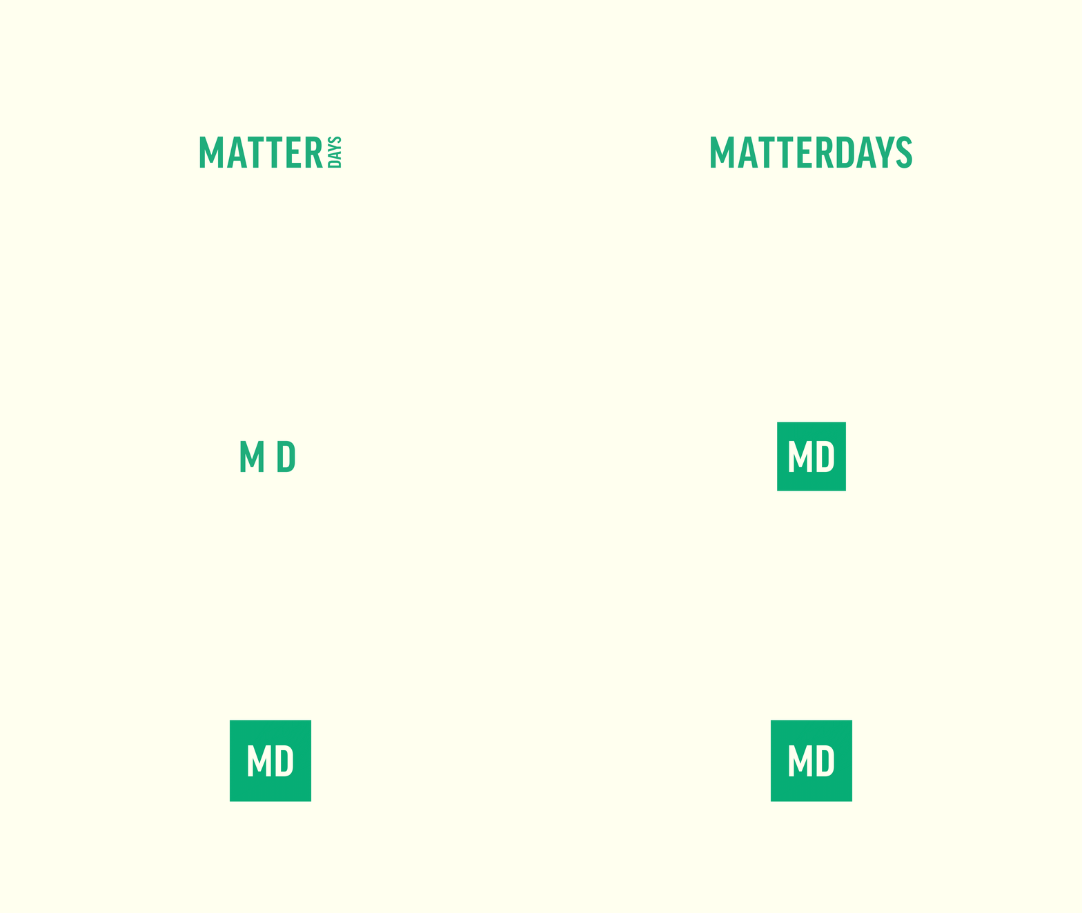
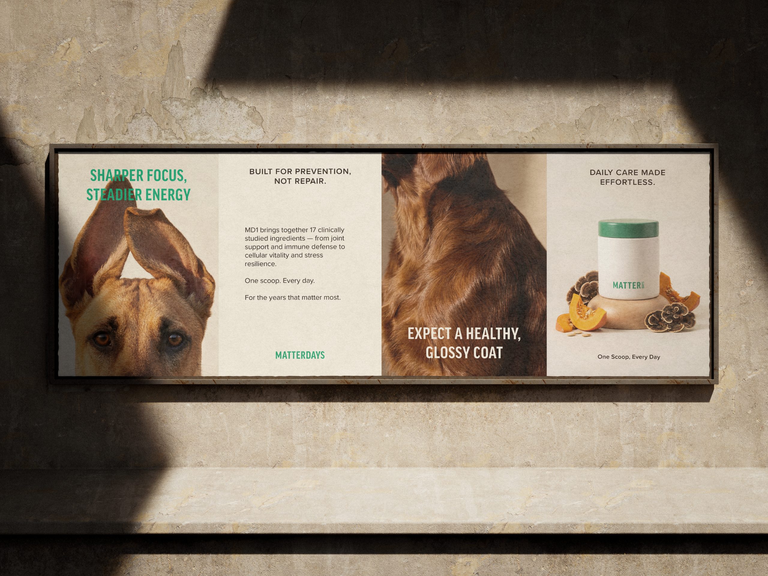
Matterdays is a preventative pet wellness brand built around the belief that every day matters. The name became the foundation of the concept, inspiring a calendar-based system that transforms daily supplementation into a meaningful ritual of care.
 
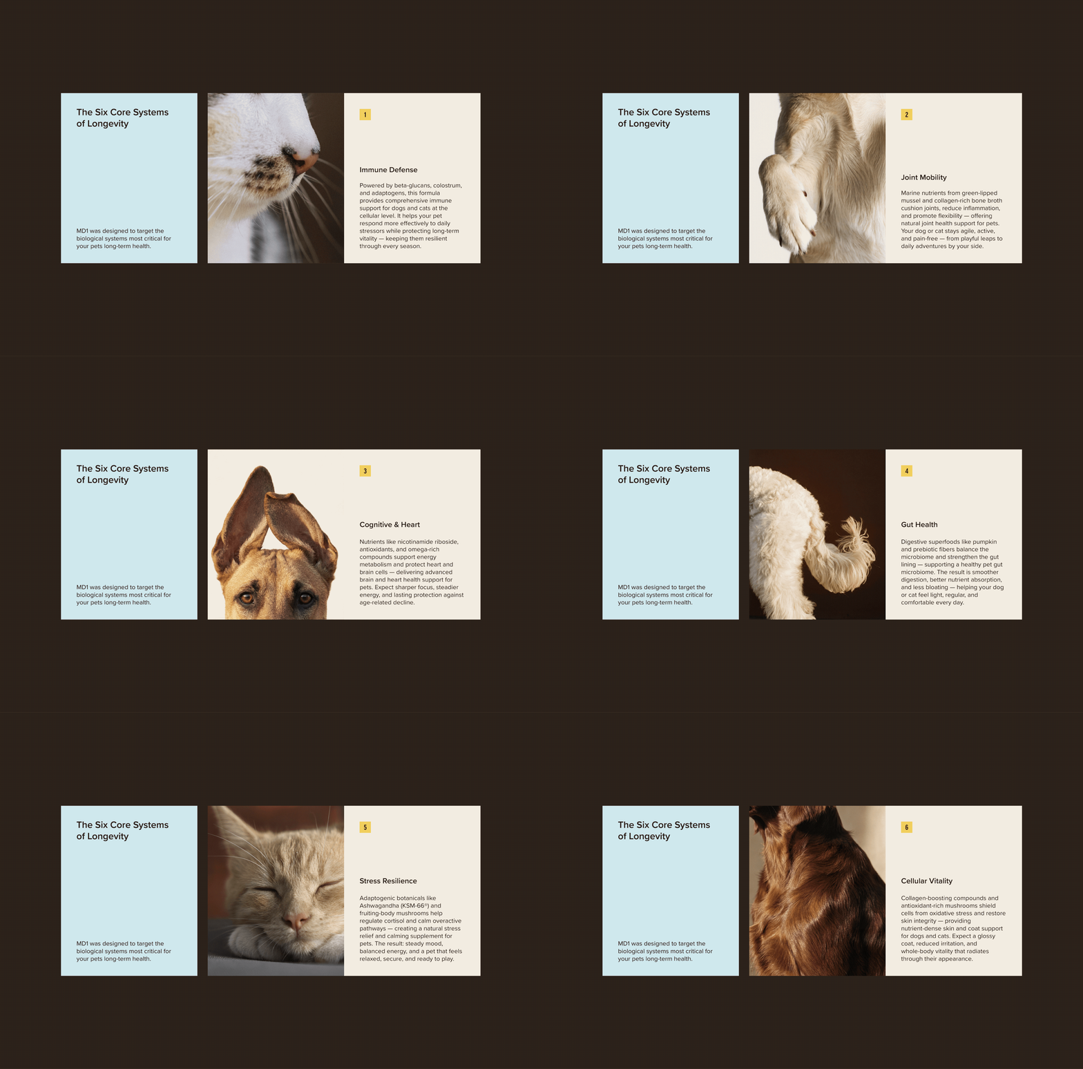
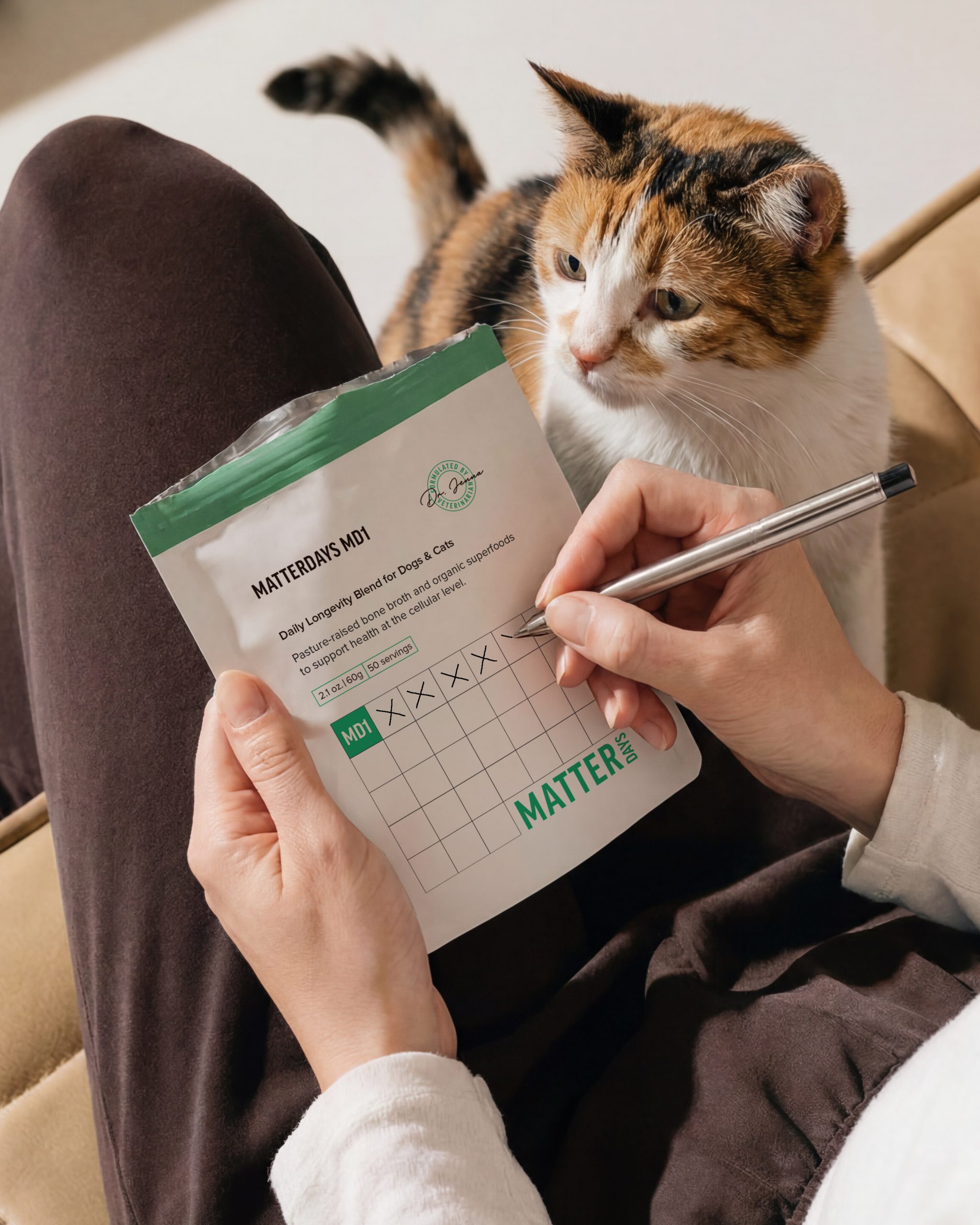
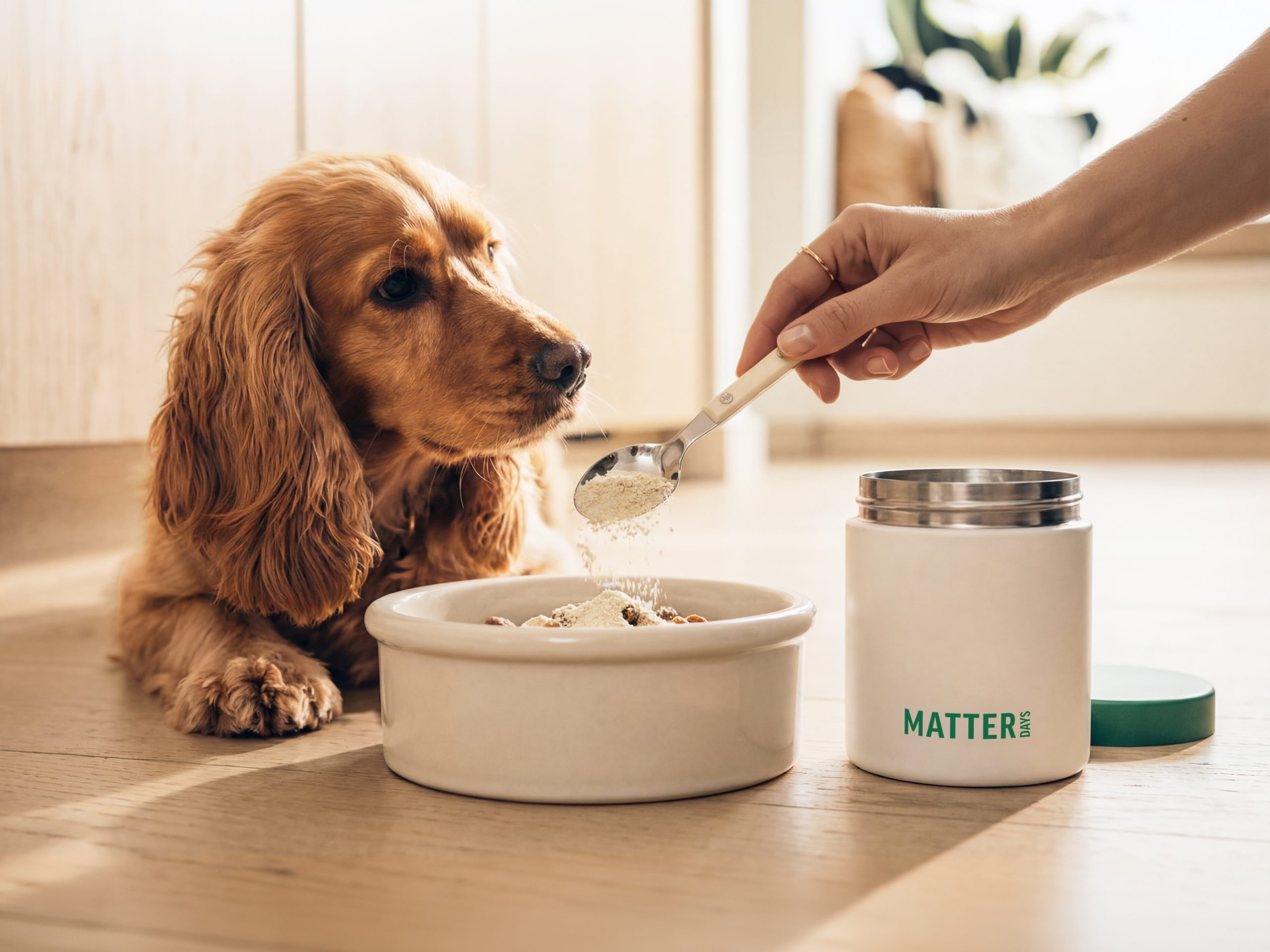
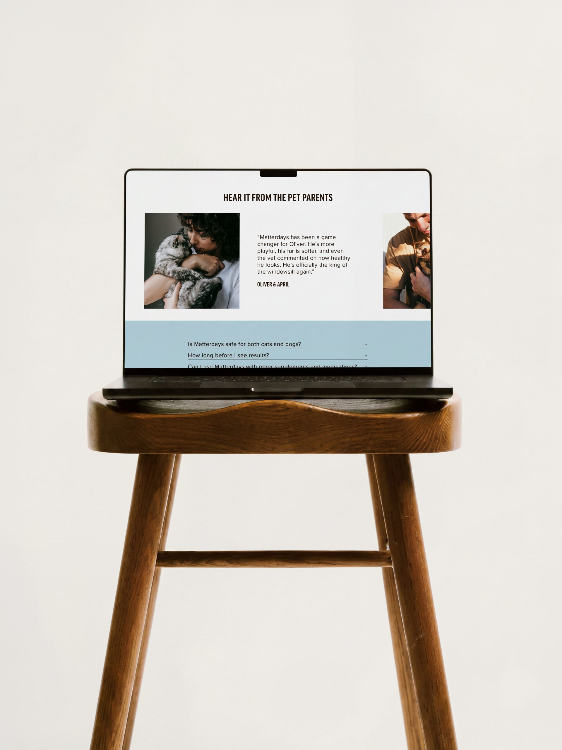
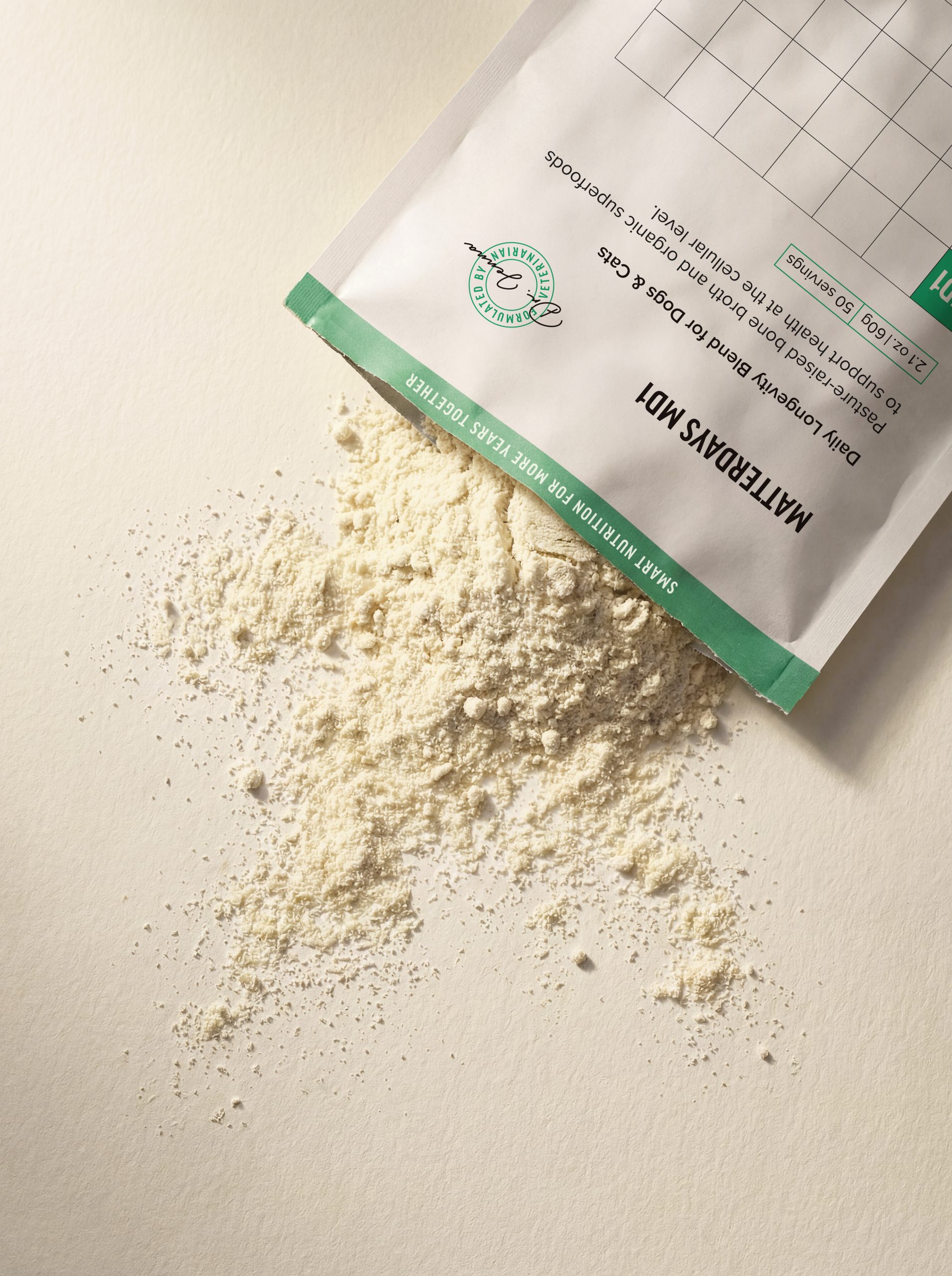
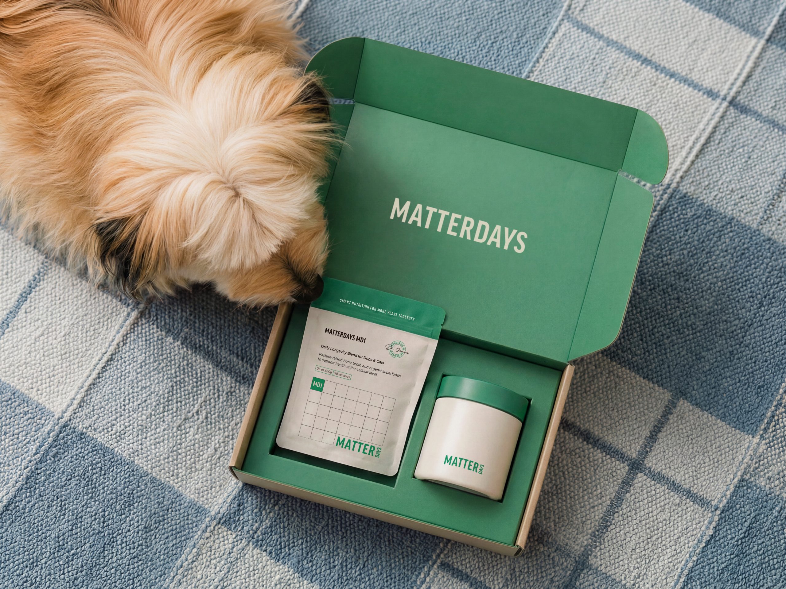
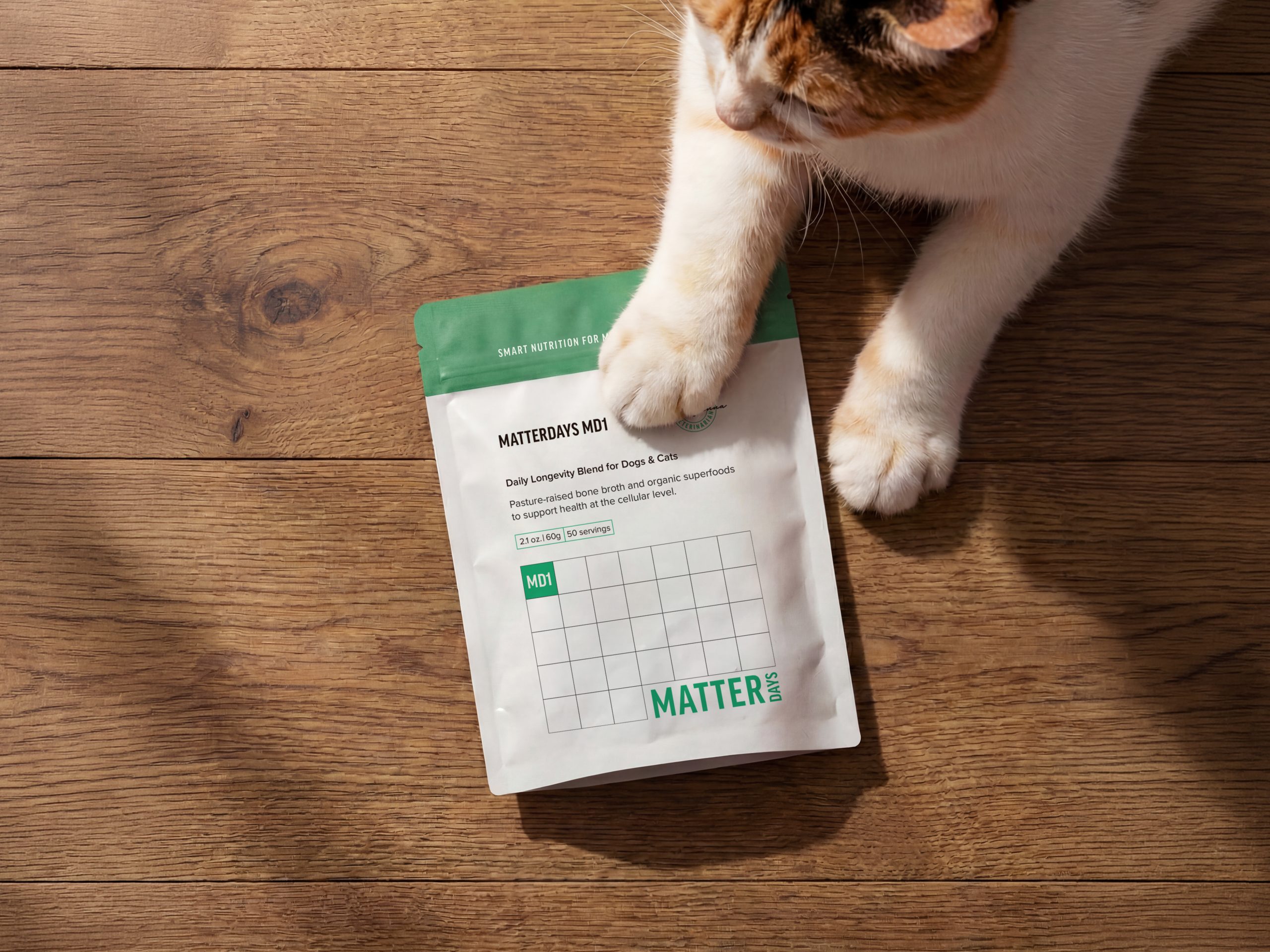
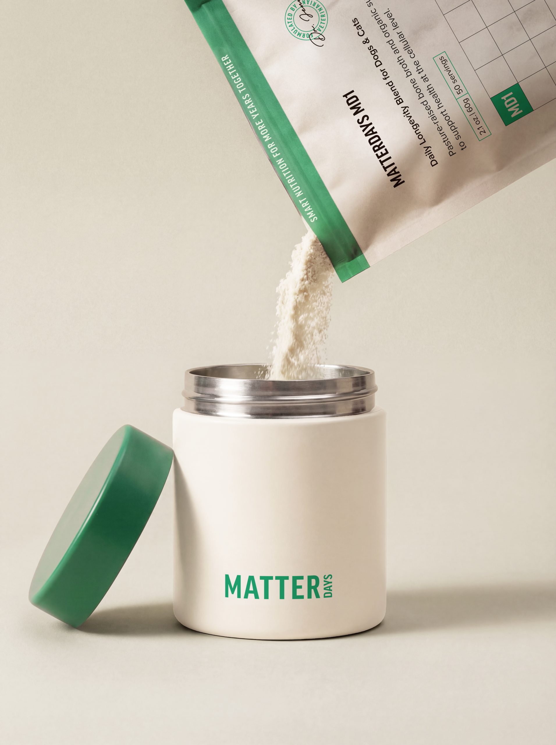
The brand offers an all-in-one supplement for cats and dogs designed to prevent health issues before they begin to show, shifting the narrative from reactive treatment to proactive wellness. I translated this idea directly into the packaging design by creating a resealable pouch that functions not only as a container, but also as a built-in tracking tool. A calendar grid is printed on the pouch, allowing pet owners to mark each day they administer the supplement, reinforcing consistency and habit-building. Each grid can be used traditionally or divided into two for extended use, making the packaging interactive, practical, and long-lasting. For subscribers, an optional airtight canister provides a refined storage solution that preserves freshness while elevating the everyday experience. Visually, the brand is anchored in a signature green that represents health, growth, and longevity, supported by uplifting blue and warm yellow accents that add optimism and approachability.
Matterdays

A preventative pet wellness brand that transforms daily supplementation into a simple, trackable ritual of care.

Project Details

Client:

Industry:

Services:

Matterdays

Pet

Creative direction, brand identity & packaging design

Matterdays is a preventative pet wellness brand built around the belief that every day matters. The name became the foundation of the concept, inspiring a calendar-based system that transforms daily supplementation into a meaningful ritual of care.
 
The brand offers an all-in-one supplement for cats and dogs designed to prevent health issues before they begin to show, shifting the narrative from reactive treatment to proactive wellness. I translated this idea directly into the packaging design by creating a resealable pouch that functions not only as a container, but also as a built-in tracking tool. A calendar grid is printed on the pouch, allowing pet owners to mark each day they administer the supplement, reinforcing consistency and habit-building. Each grid can be used traditionally or divided into two for extended use, making the packaging interactive, practical, and long-lasting. For subscribers, an optional airtight canister provides a refined storage solution that preserves freshness while elevating the everyday experience. Visually, the brand is anchored in a signature green that represents health, growth, and longevity, supported by uplifting blue and warm yellow accents that add optimism and approachability.
Let's Connect

Reach out to me for new projects or anything design related!

Get in Touch