
Viora
Women’s healthcare brand designed to make intimate health feel more comfortable.
Project Details
Client:
Industry:
Services:
Viora
Wellness
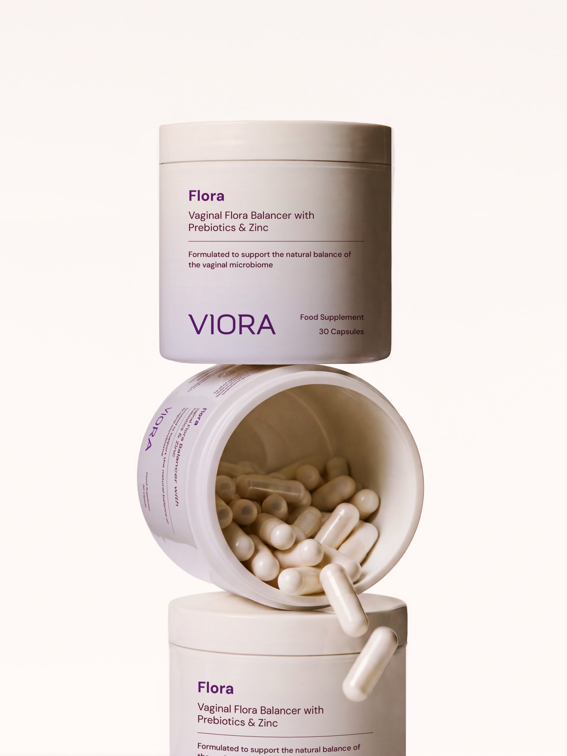
Creative direction, brand identity & packaging design
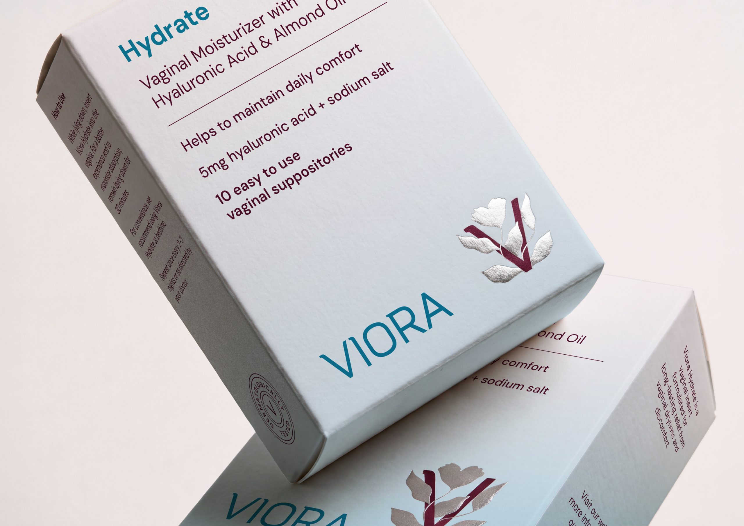
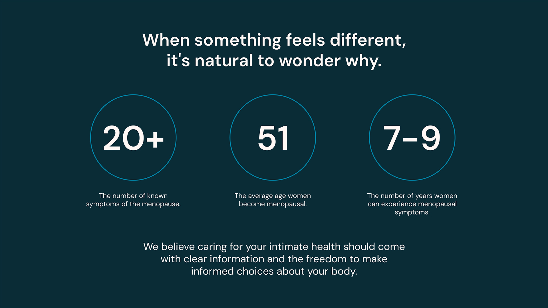
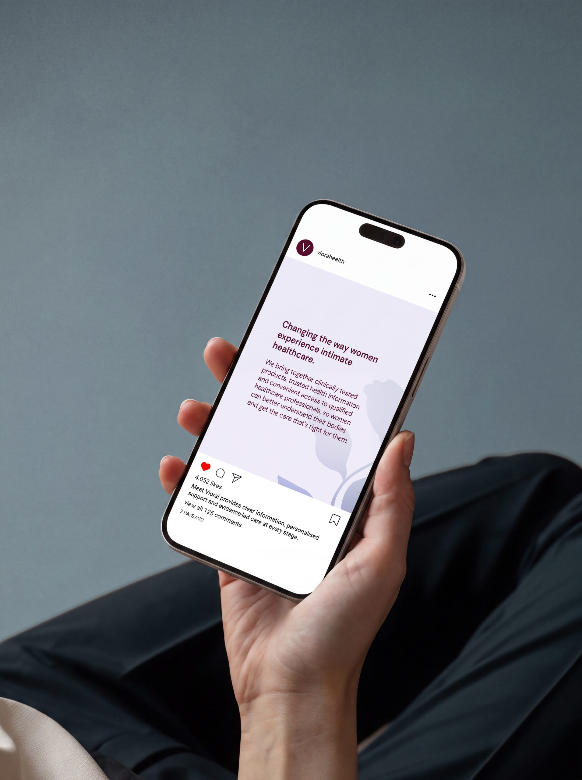
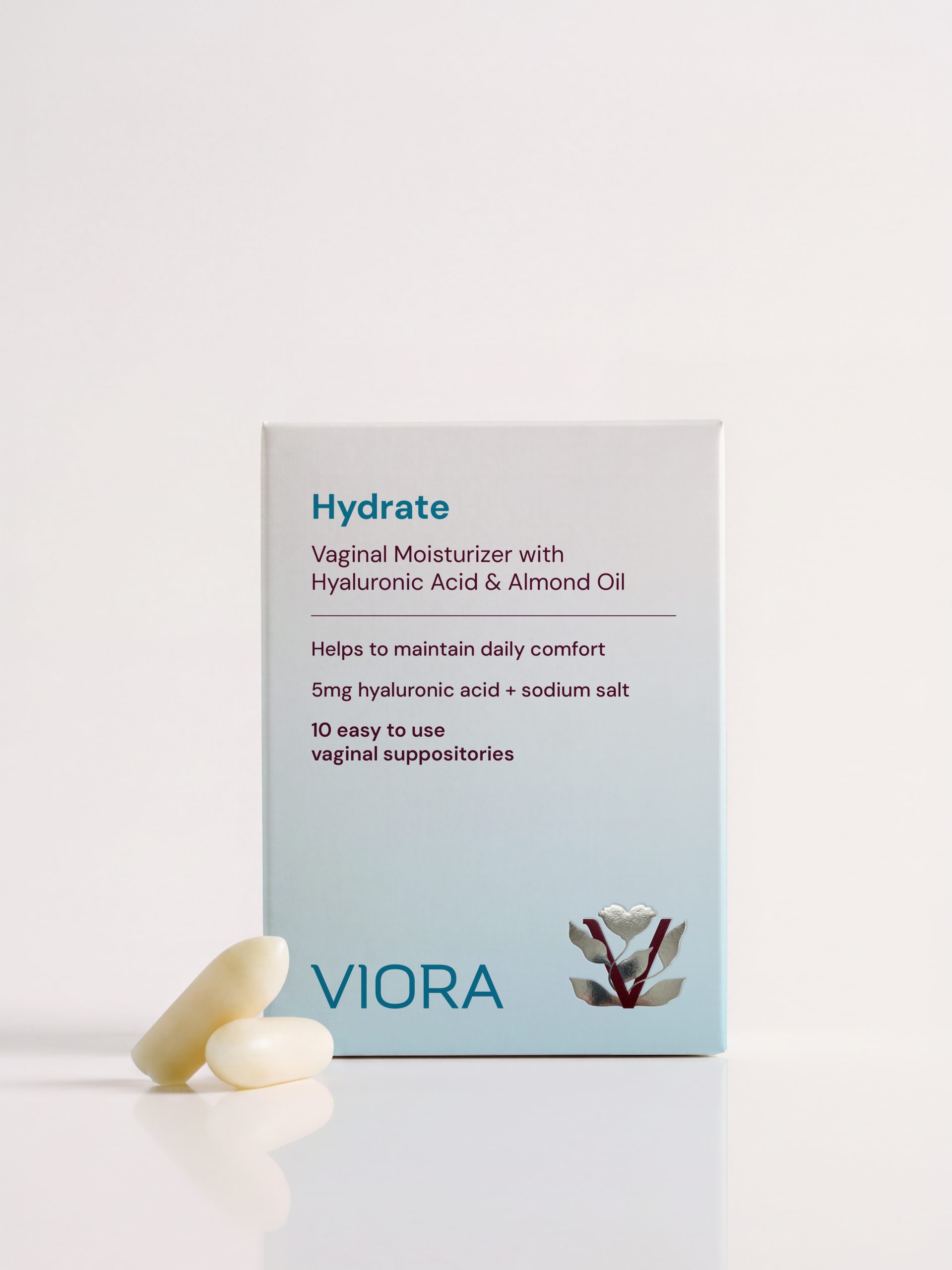
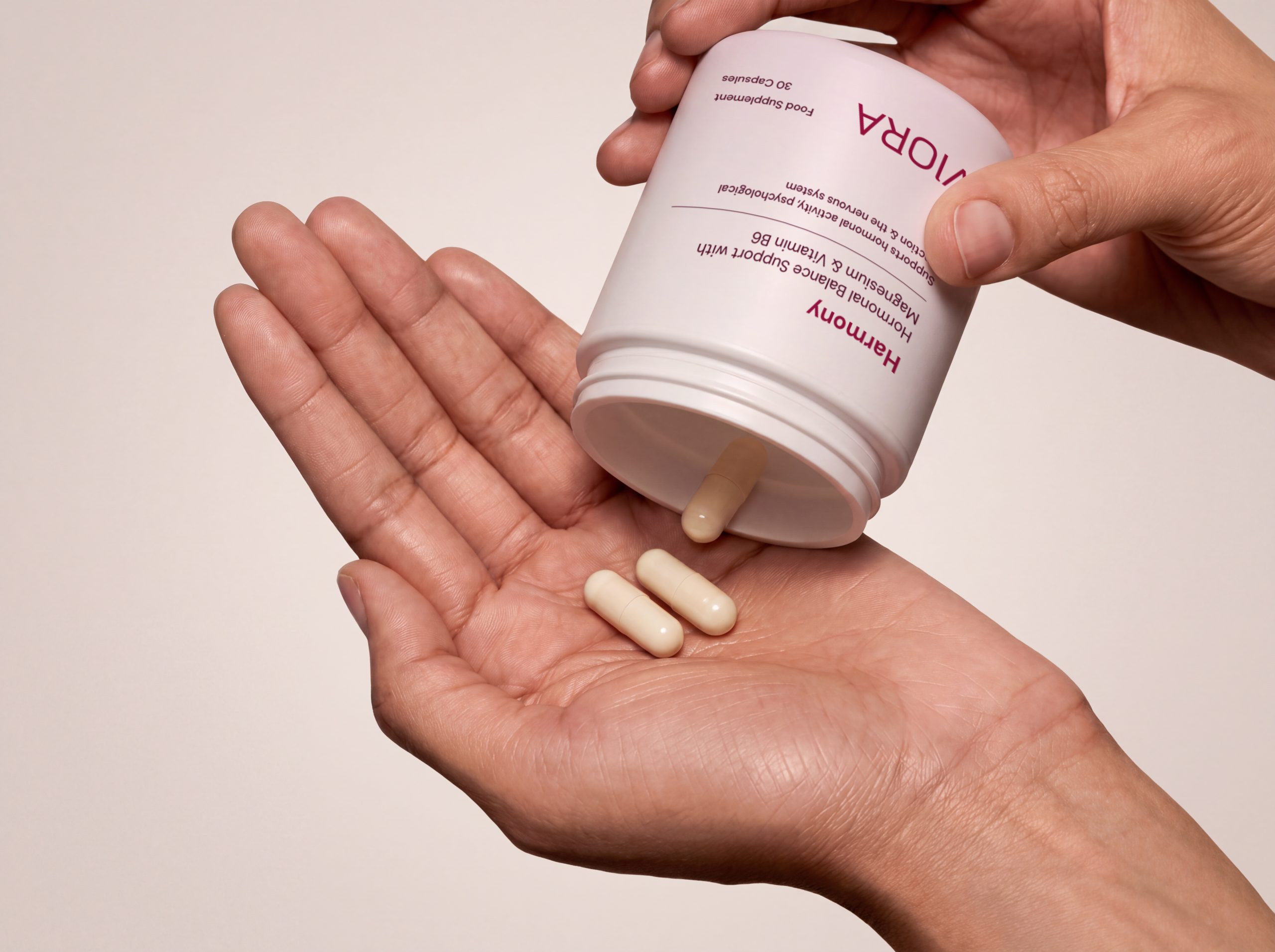
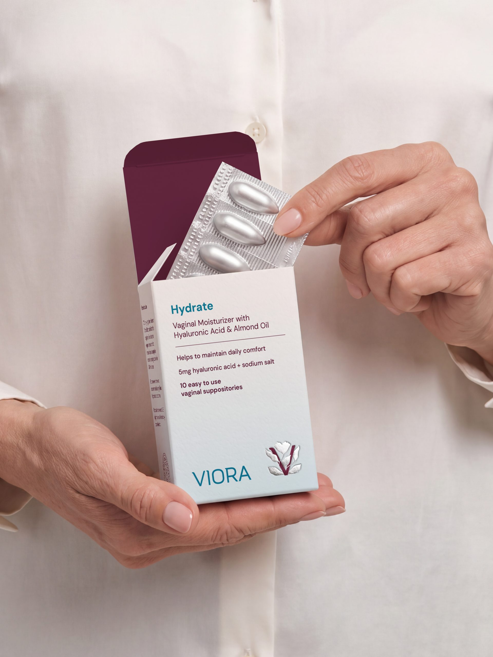
Viora is a women’s healthcare brand designed to make intimate health feel more comfortable, informed, and approachable. The brand brings together products supporting different aspects of wellbeing, along with an informative environment where women can feel more confident seeking support.
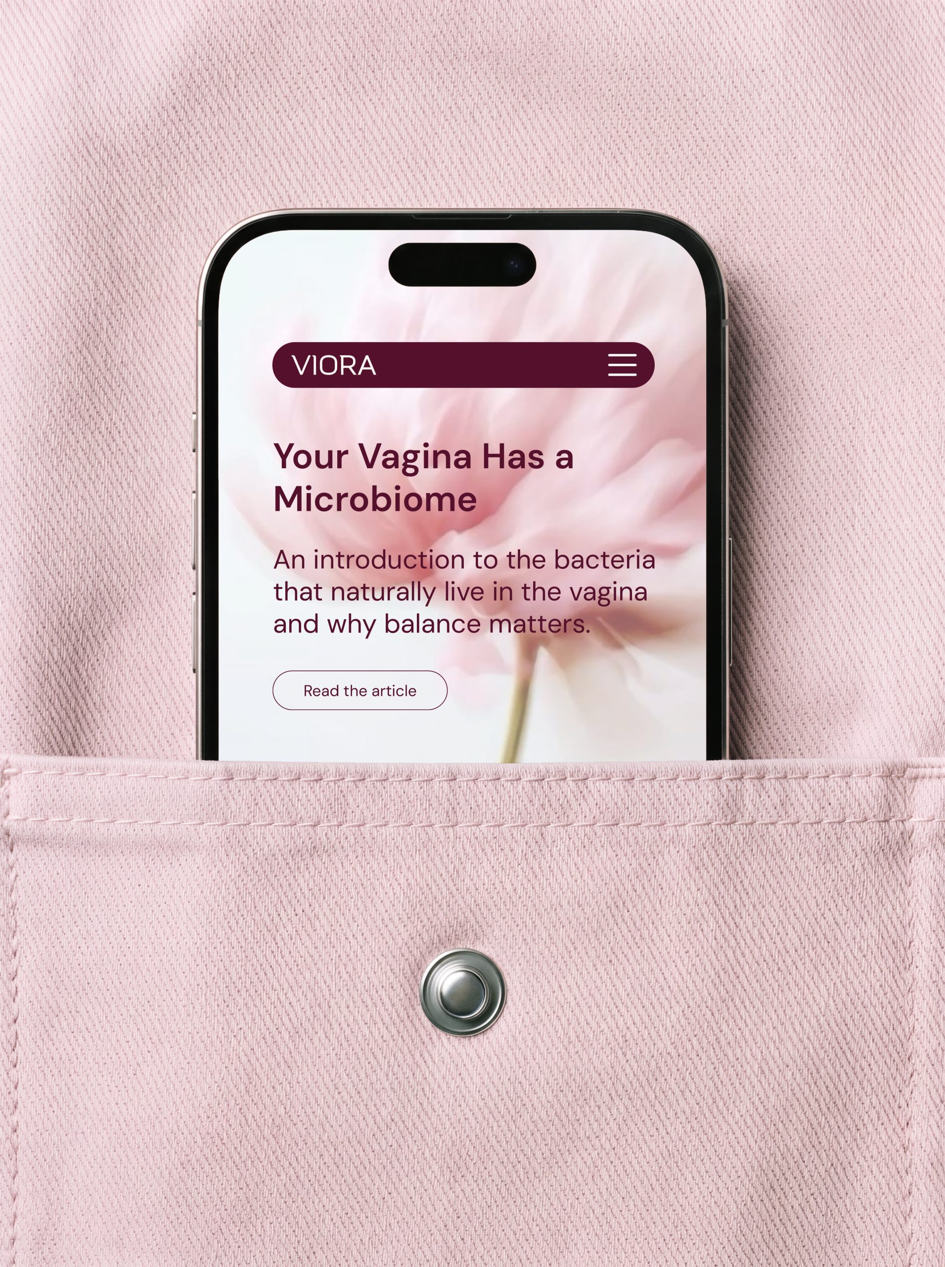
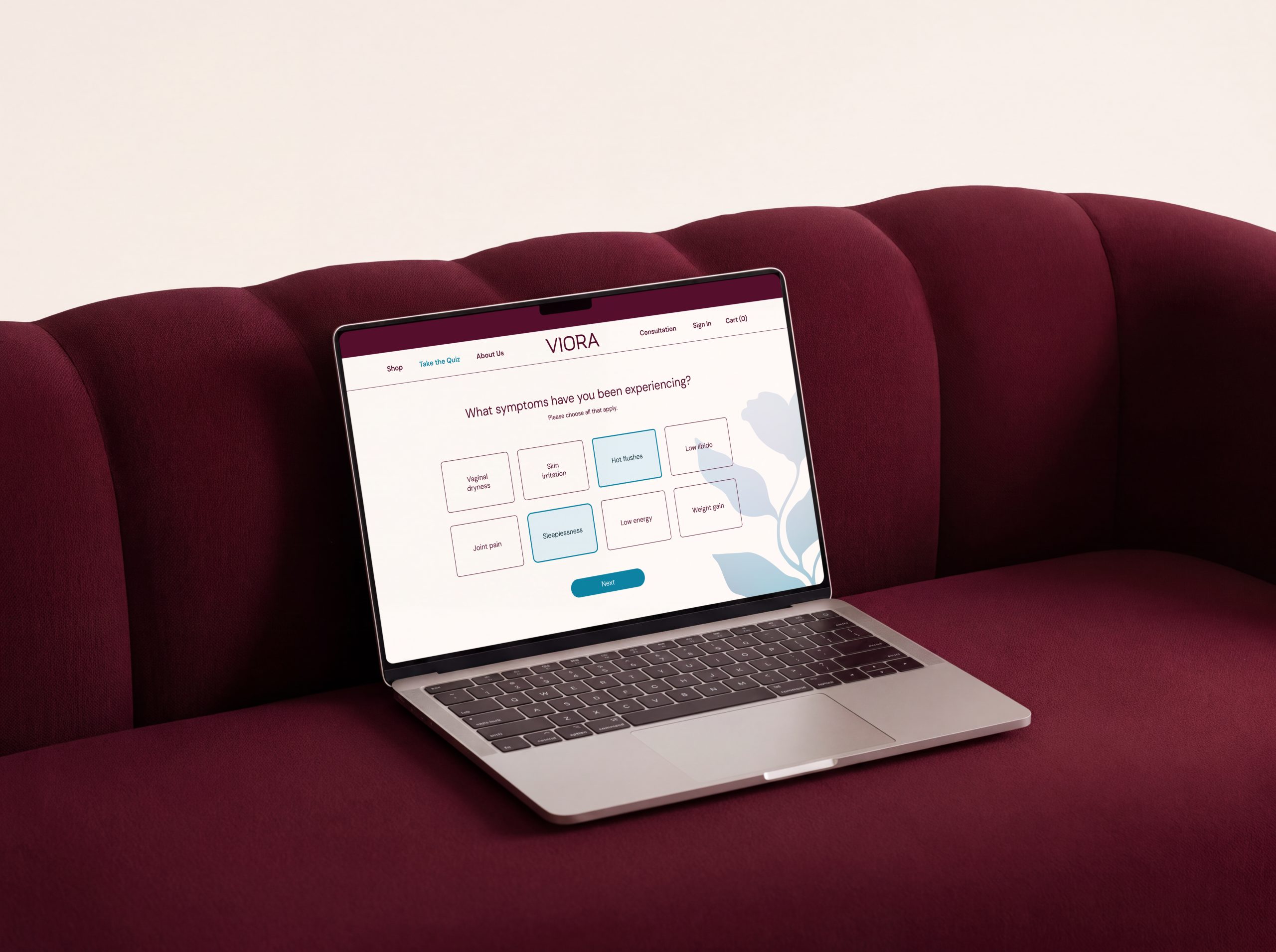
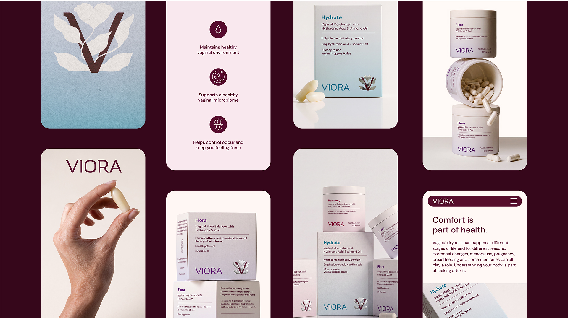
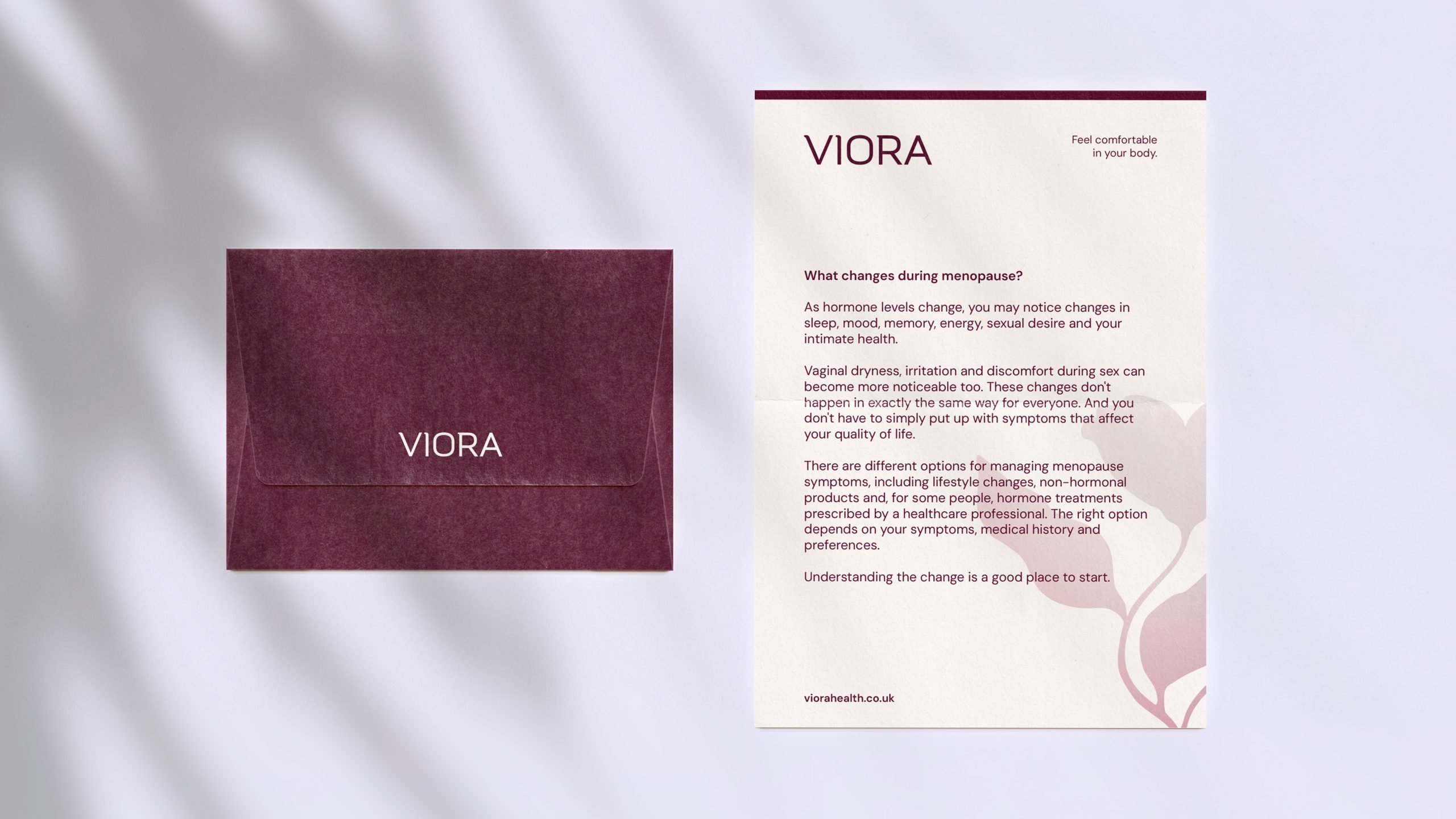
The visual identity needed to balance trust, knowledge, and approachability, creating a brand that feels professional, warm, and easy to engage with, while sitting naturally between medical healthcare and skincare.
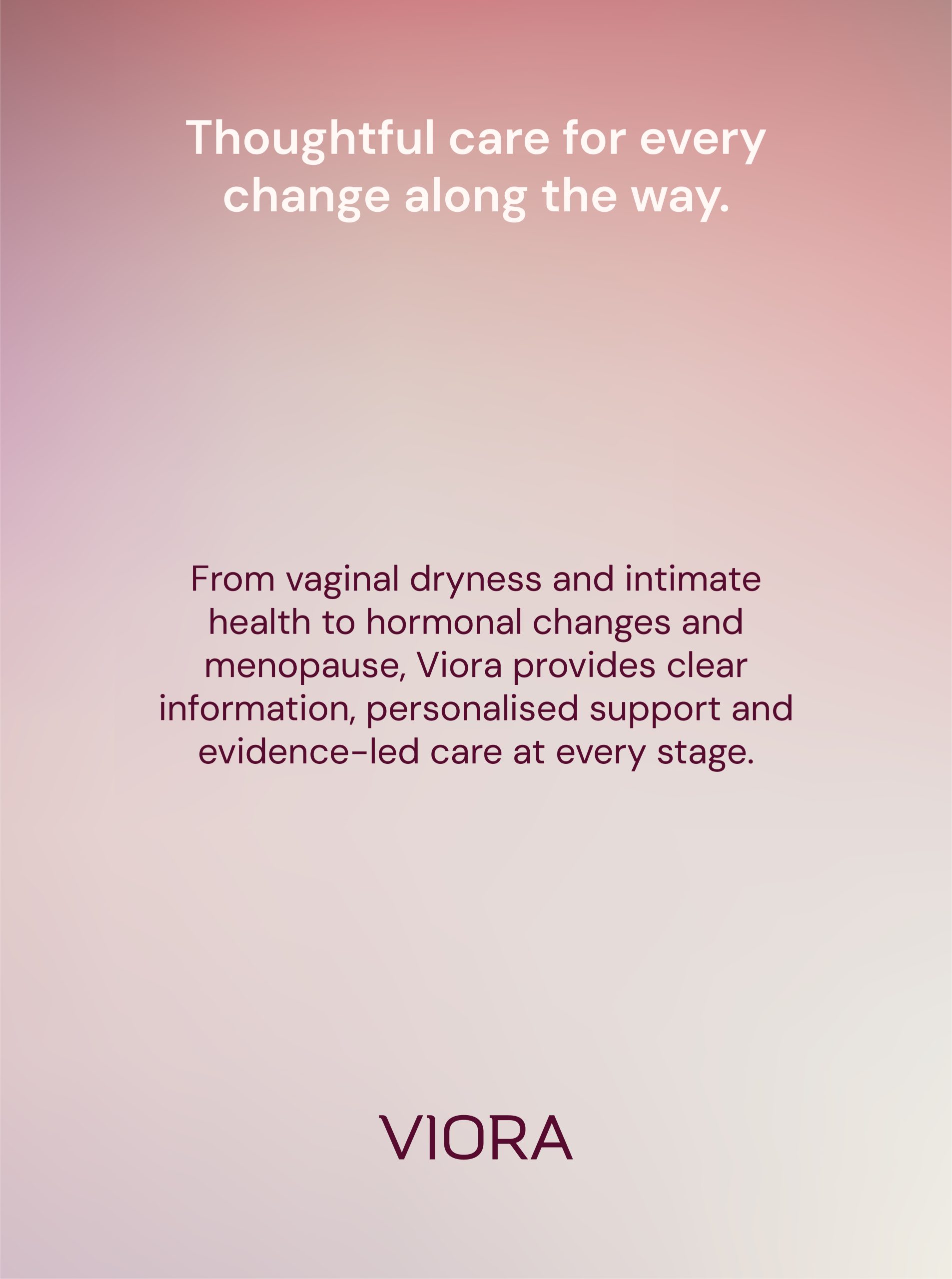
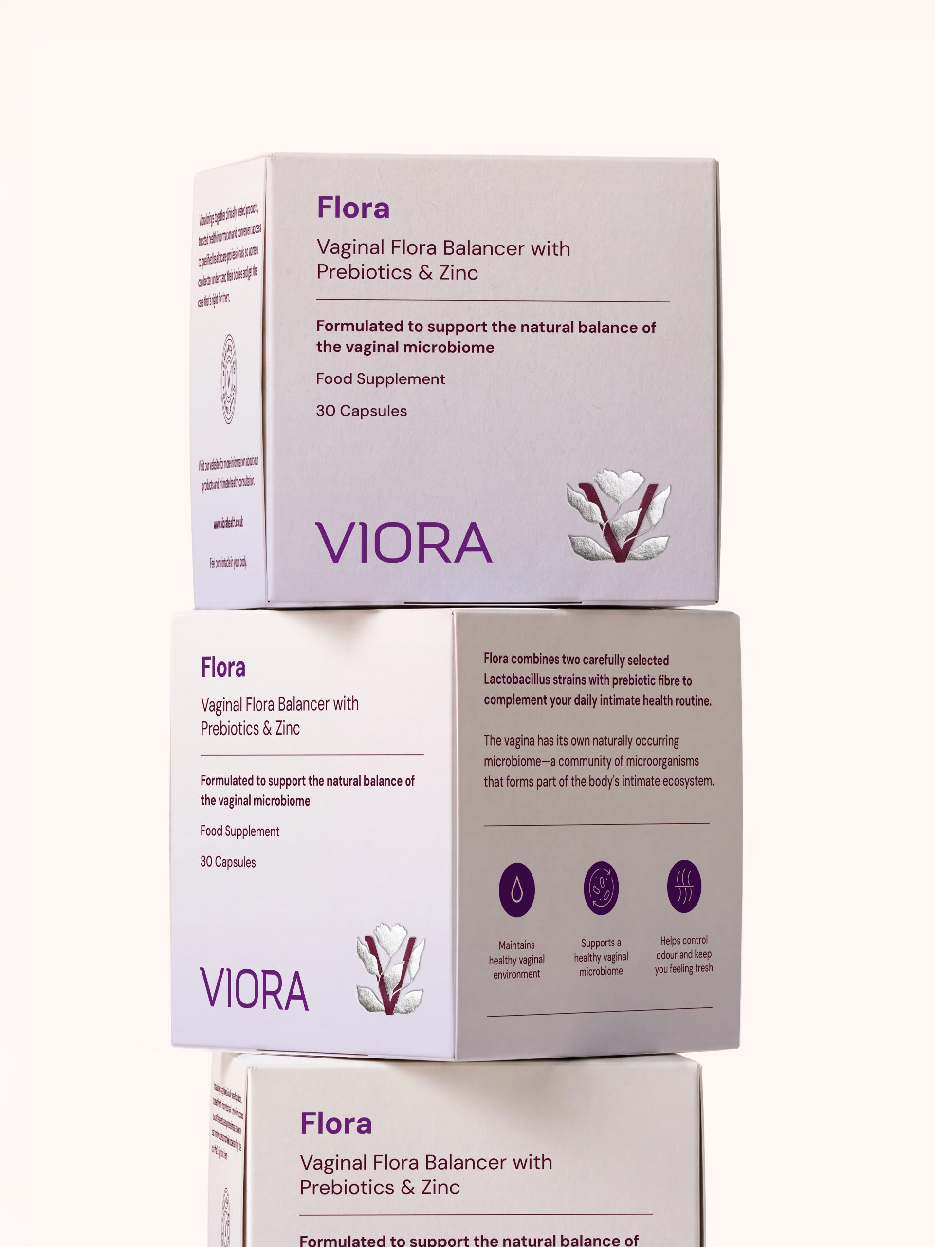
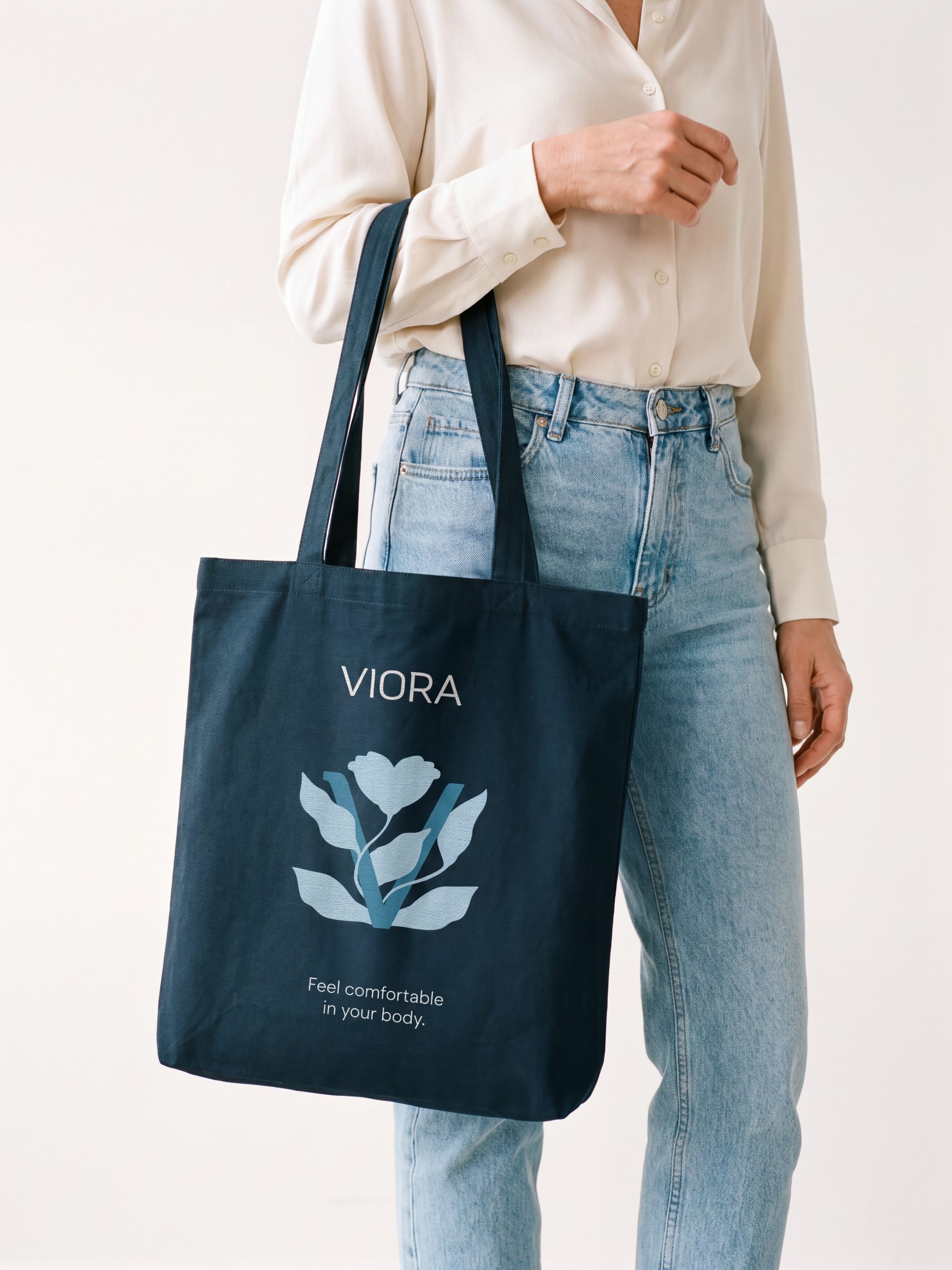
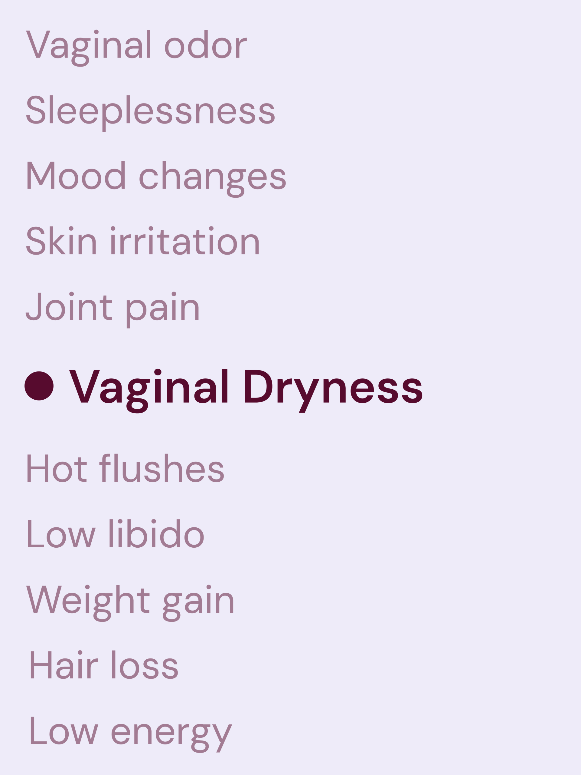
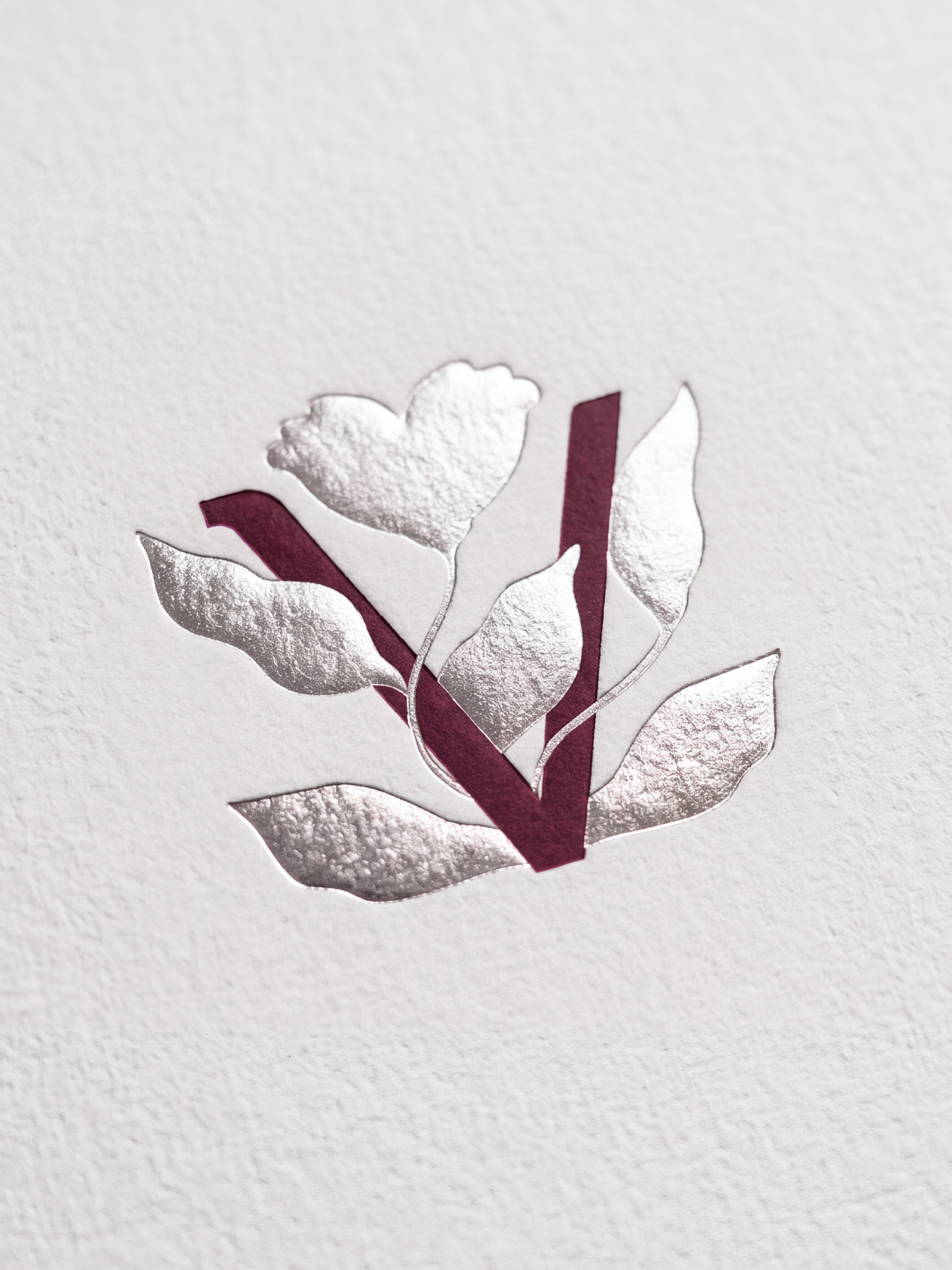
The brand identity is built around soft colors, clear typography, and information-led layouts. The use of a deep burgundy as the primary brand colour reflects the brand’s sense of authority. Typography is kept clean, modern, and highly legible, supporting the brand’s focus on clarity and effective communication. The botanical symbol introduces a more organic element into an otherwise structured identity. Its natural, flowing form creates a considered contrast against the precision of the typography and the clarity of the information hierarchy. Together, these elements create a balanced visual identity that combines professionalism and structure with softness and a sense of human connection.

Let's Connect
Reach out to me for new projects or anything design related!