


MAGS Skin
A refined, minimalist identity and packaging system for a brand dedicated to delivering gentle, natural deodorant solutions for sensitive skin.
Project Details
Client:
Industry:
Services:
MAGS Skin
Wellness
Brand identity & packaging design
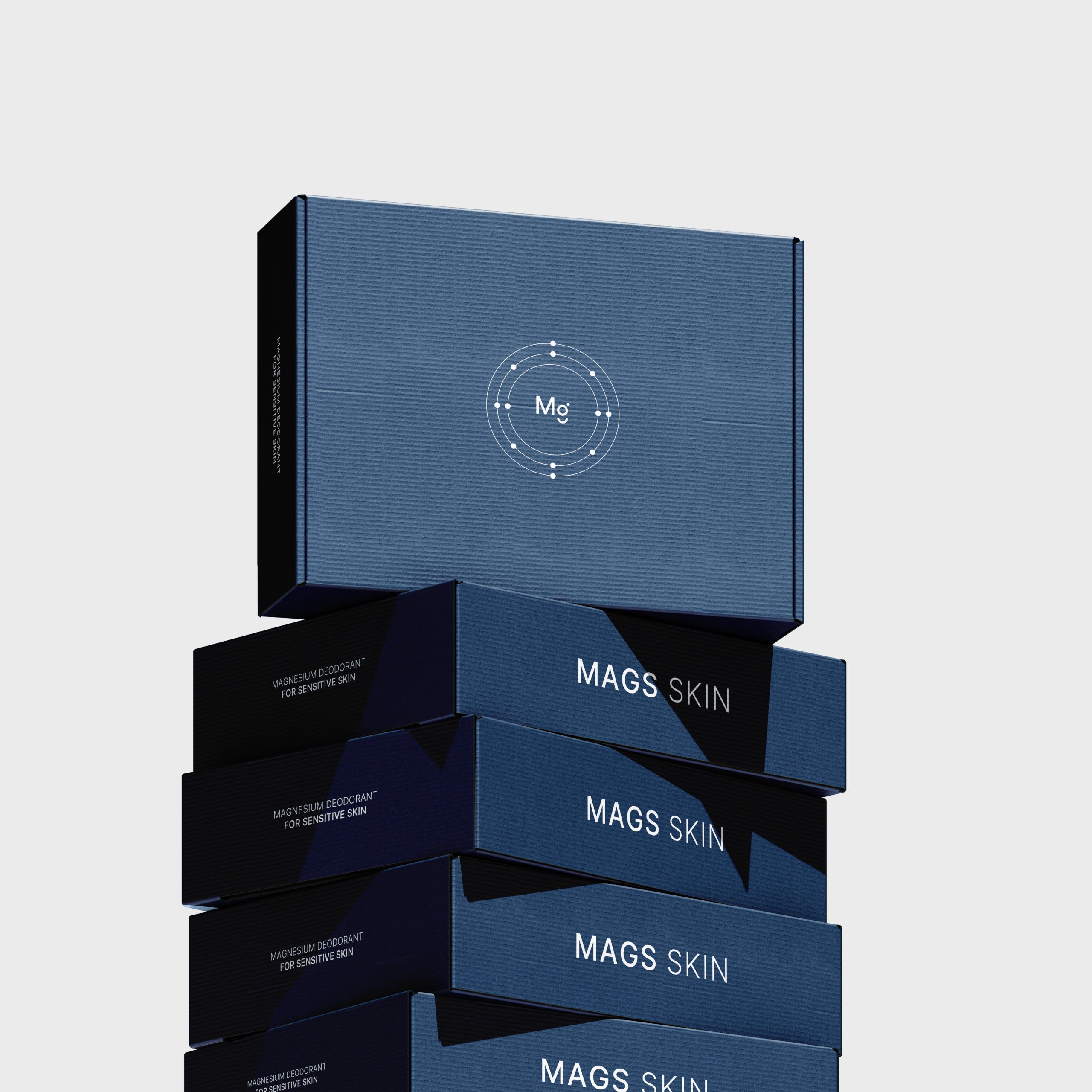
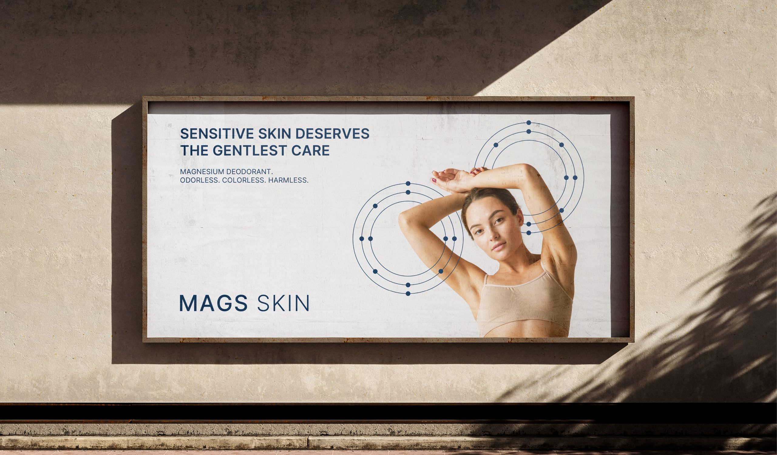
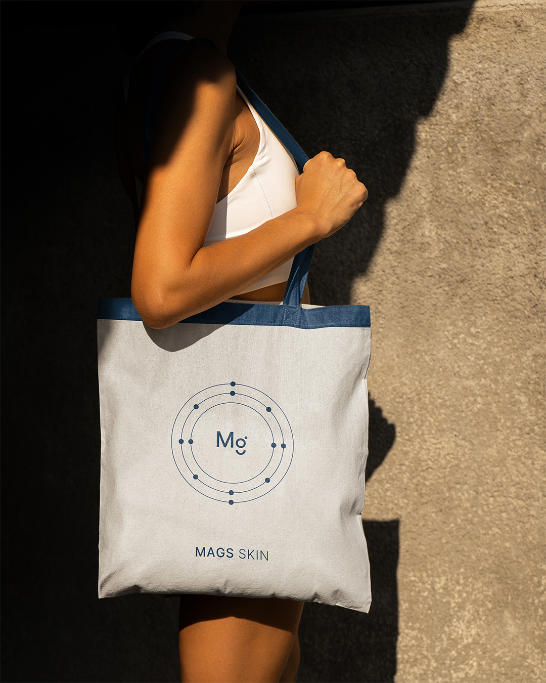
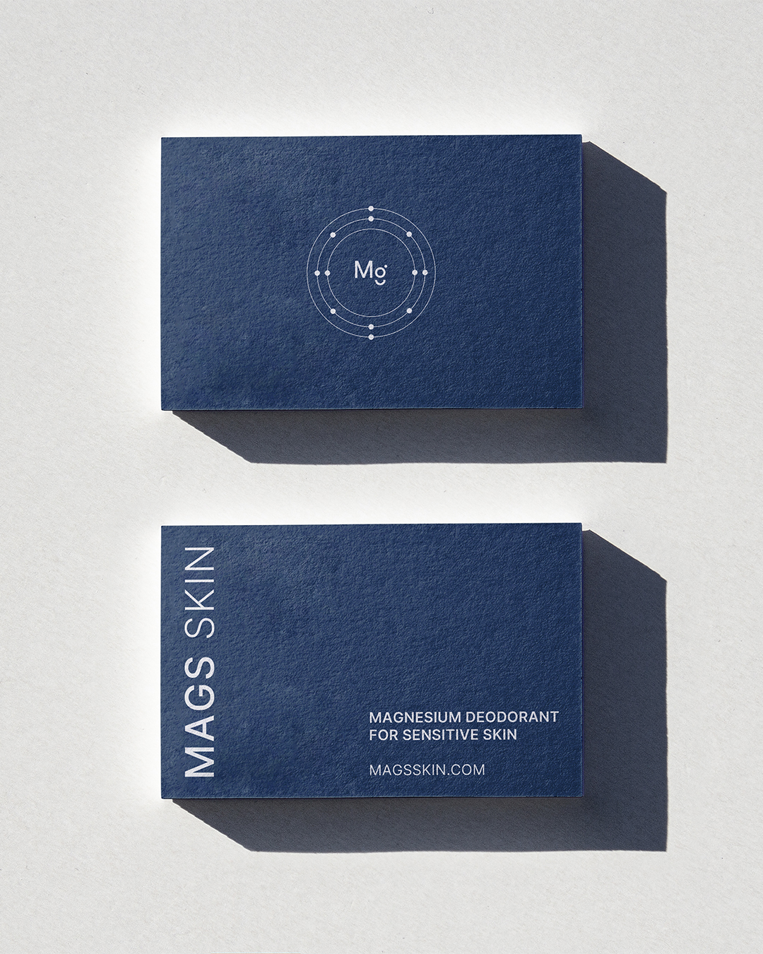
The identity system centers around magnesium, the active ingredient of the deodorant, as both the scientific and symbolic heart of the brand. The circular atom-inspired logo represents magnesium’s elemental power. Soft, desaturated navy and powder white palette builds trust and safety. A modern sans-serif typeface was chosen for its clarity, balance and softness. Its geometric forms align with the circular motif of the atom symbol, creating a cohesive visual rhythm across all materials.
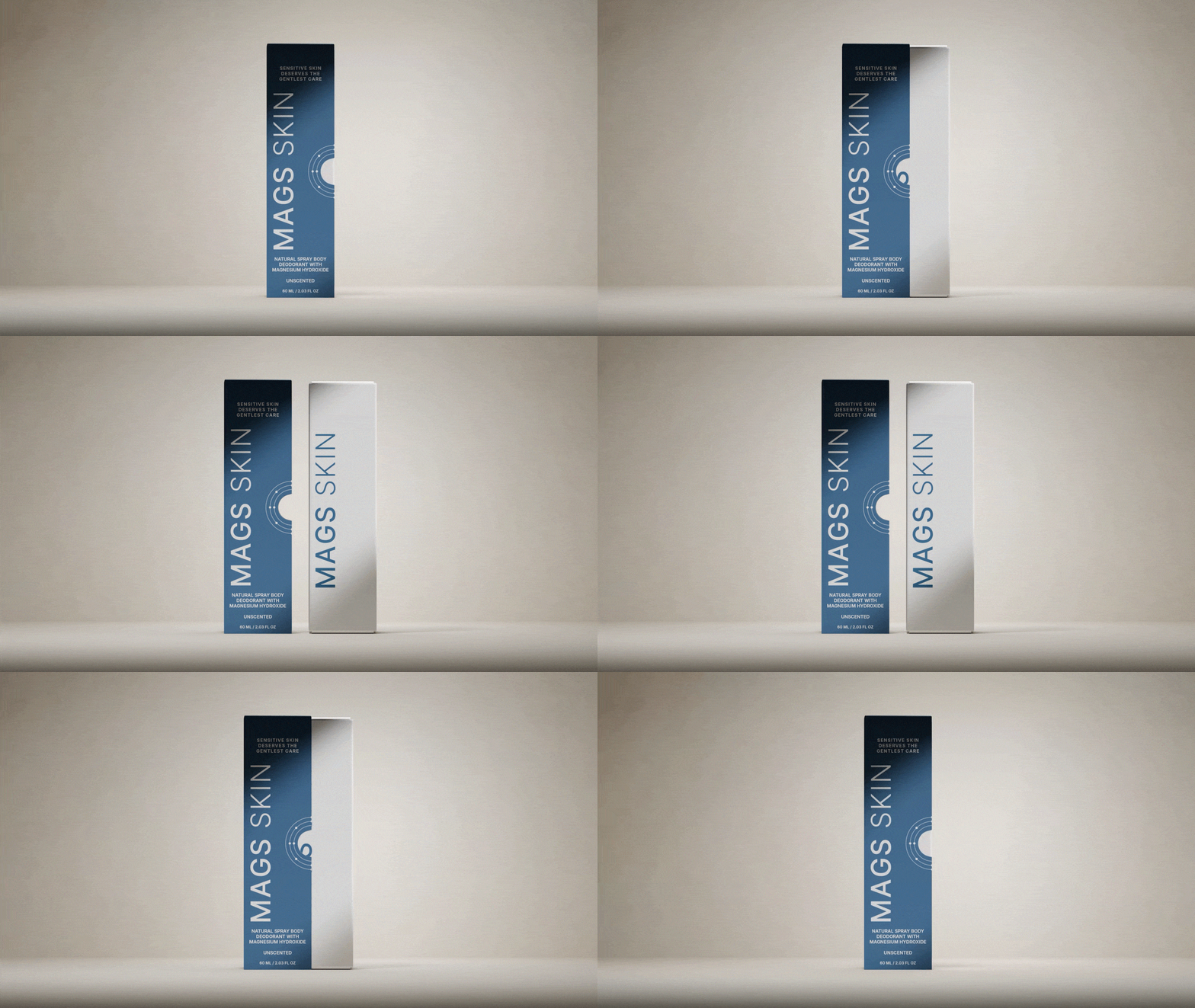
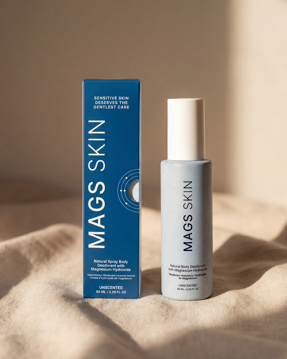
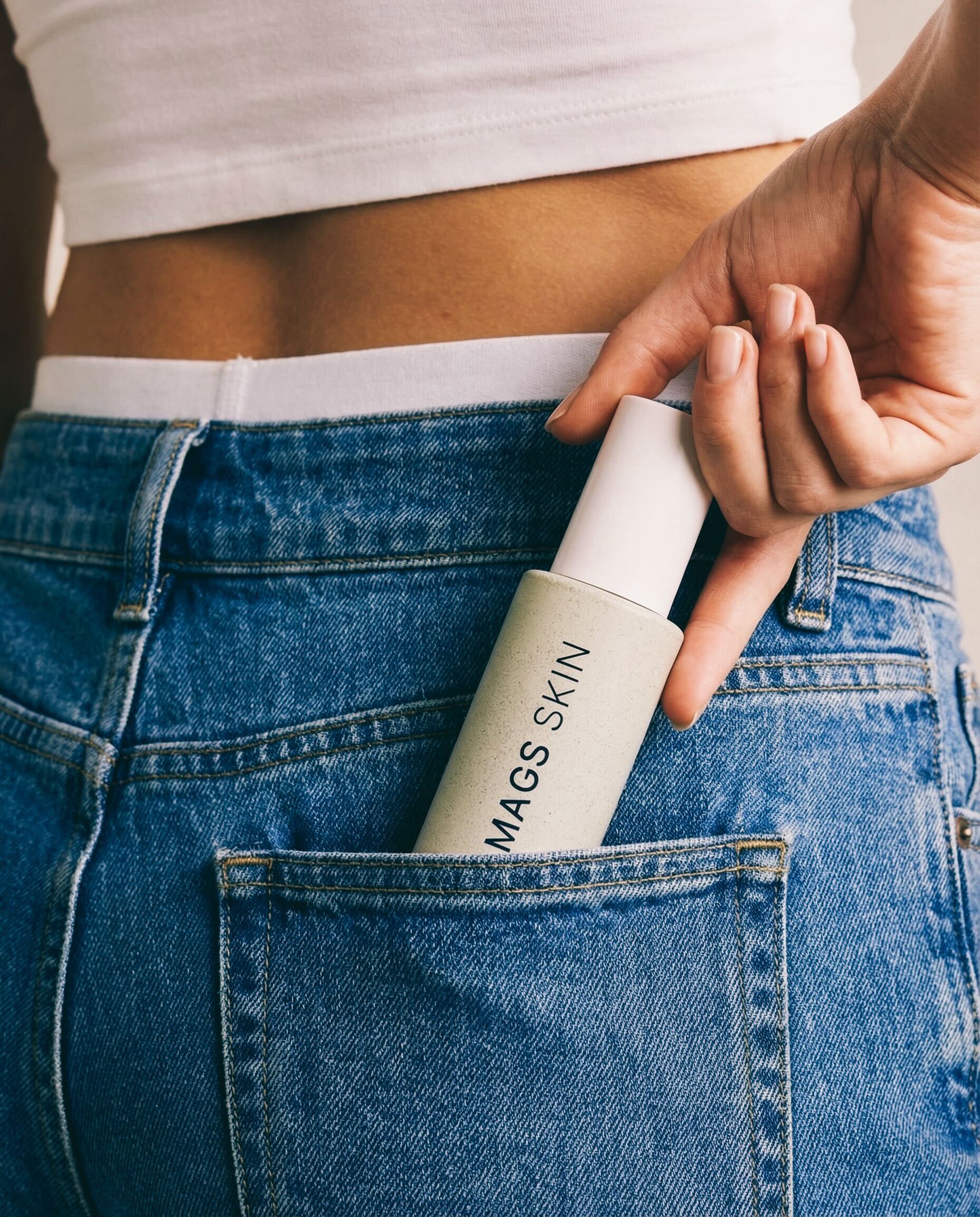
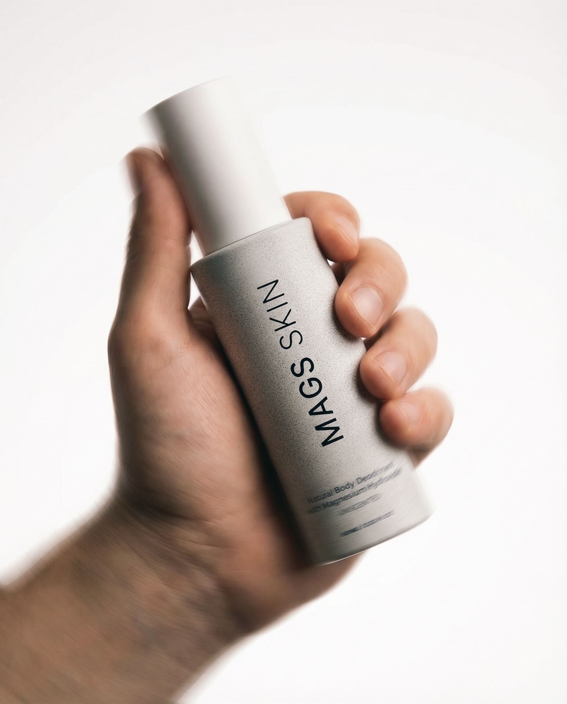
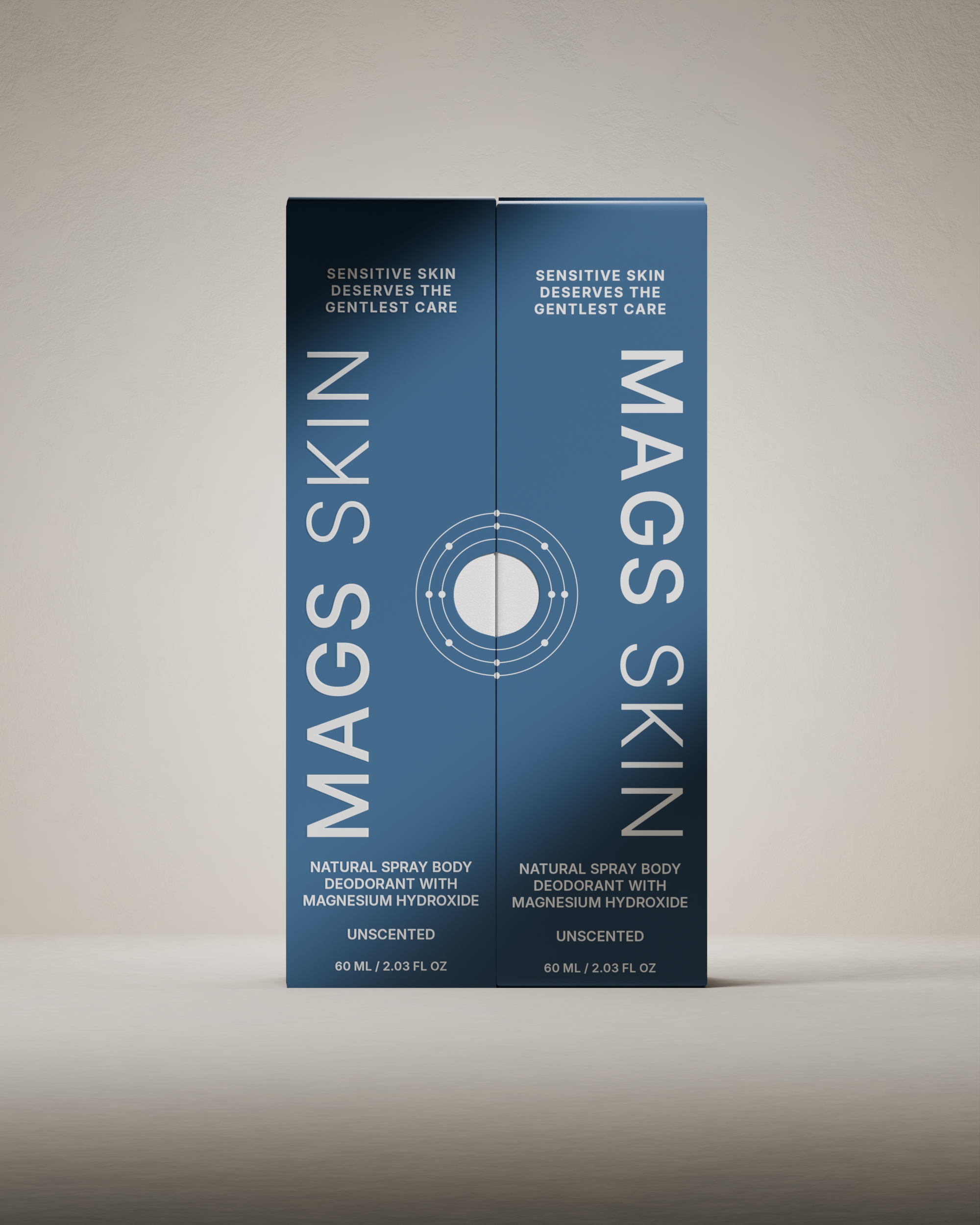
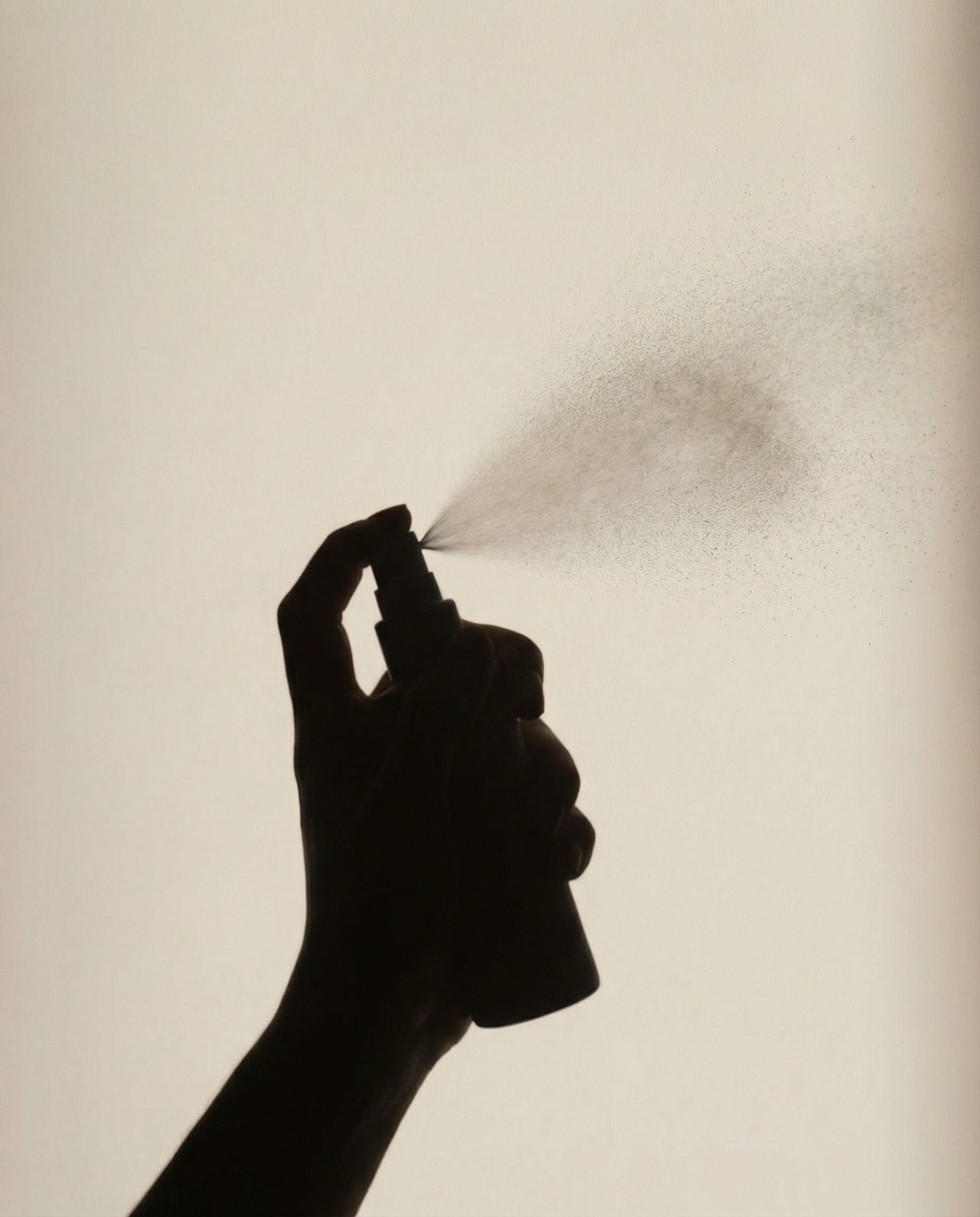
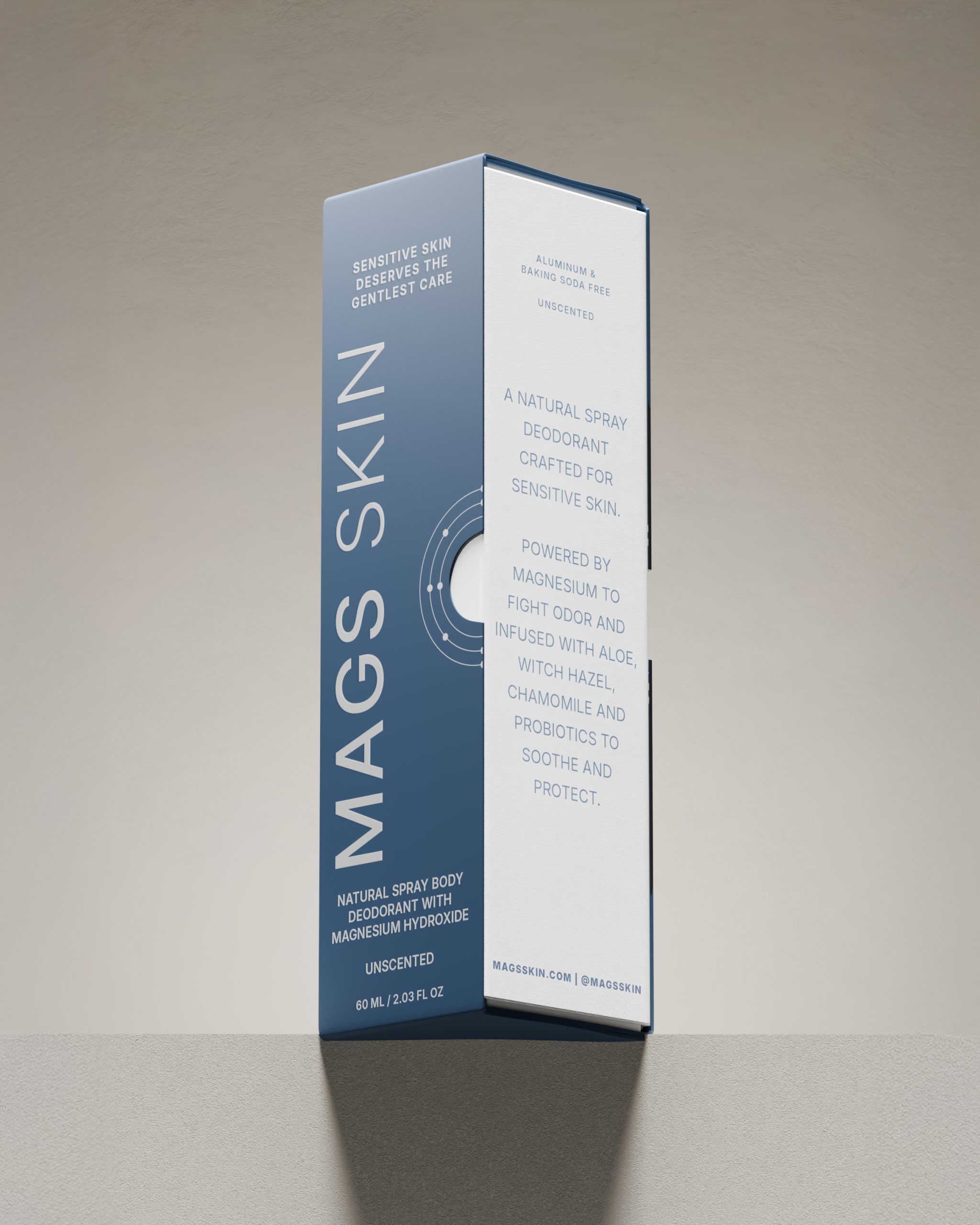
The packaging features a dual-layer box construction, combining brand presence with functional storytelling. The outer navy case serves as the brand’s first impression, conveying professionalism and confidence. Nestled inside the outer case, the white interior box carries detailed product information, usage benefits and a clear breakdown of the natural ingredients. The separation of packaging layers mimics a clinical unboxing experience, building user trust while enhancing clarity. The spray bottle features the same minimalist branding, combining aesthetic appeal with ergonomic design and a textured finish that offers a premium, tactile experience.



Let's Connect
Reach out to me for new projects or anything design related!